A logo can make or break a company, brand, or franchise. Once a brand has developed a logo, its customers will immediately form opinions about the franchise behind the logo. The better the logo, the more people will gravitate toward the brand and retain better, more positive memories of the company. However, if a brand fails at creating an iconic logo, people will think less of it and think of it less.
Subway, an iconic sub sandwich franchise, has always had an iconic logo to go with it. The name "Subway", along with the first iteration of its logo, did not actually make it around until 1968, a good several years after the first location had opened its doors.
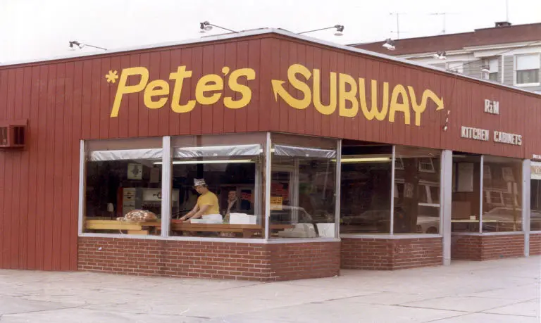
Even when Subway was still Pete's Subway, the Subway logo included the iconic arrows attached to the bottom of the "S" and the top right branch of the "Y" in Subway, originally being used to signal the entrance and exit of the store. As Subway continued to evolve, those arrows became a symbolic expression of the ability to enter, quickly get your personally customized sub sandwich, quickly pay for your food, and exit.
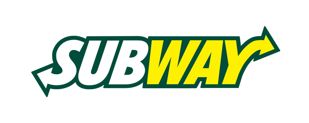
As the years went on, the Subway logo went under a few different changes. The first major change it underwent was the addition of an oval shape behind the Subway logo, referencing a sub sandwich shape. The first of the background ovals was black but was later changed to a dark green color. The letters of "Subway" were also changed to be split into two parts, with "Sub" now colored white and "way" now colored a more vibrant yellow.
The next set of changes removed the oval background shape representing a sub sandwich and instead brought a dark green border around the letters, which had now been italicized for further emphasis. The coloring of the Subway letters themselves remained the same, with "Sub" staying bright white and "way" continuing in a vibrant yellow.
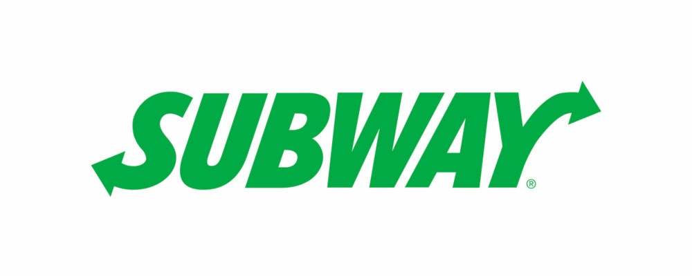
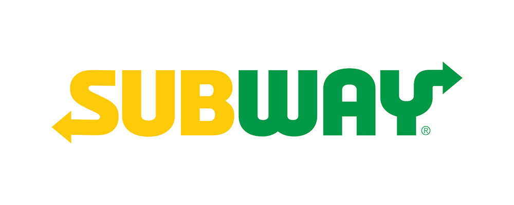
In 2016, as franchise after franchise remodeled and renovated their images and logos to be more simplistic, Subway was not one to be left out of the latest trend in marketing. The iconic Subway logo, which had not seen many large changes to its design for quite some time, saw quite a drastic change when compared with all of its previous iterations. The logo saw the loss of its dark green border around its name, as well as the loss of the italic letters which had been present for quite some time at this point. The colors of the Subway logo, which had been white and yellow for longer than the logo itself had been italicized, also received a change. "Sub" was now colored yellow, while "way" was colored green. This logo, having been present for the past several years, most resembles the original Subway logo which was established in 1968.
Despite the Subway logo having gone through changes both big and small over the years, it has remained an iconic logo known all over the world.
Subway Logos Through the Years:
-
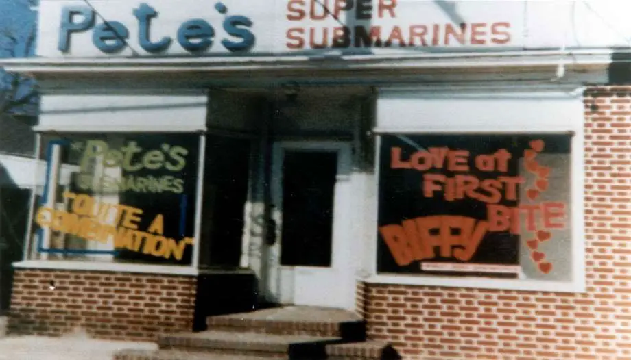 Pete’s Super Submarines, 1965 - Stamford Advocate
-
 Subway Logo 1968-2015
-
 Subway Logo 2015
-
 Subway Logo 2015 (green)
-
 Current Subway Logo (2016-present)